You are using an out of date browser. It may not display this or other websites correctly.
You should upgrade or use an alternative browser.
You should upgrade or use an alternative browser.
Can this be improved?
- Thread starter diduknowthat
- Start date

diduknowthat
formerly liuliuboy
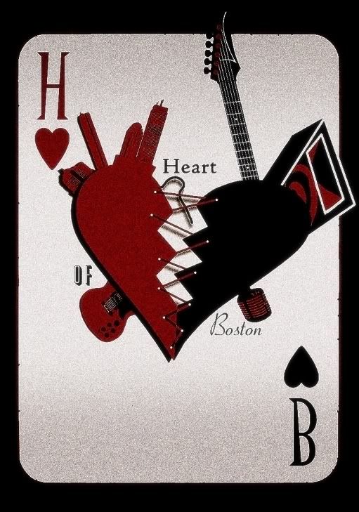
rev 3.2
http://i30.tinypic.com/2e5jlsn.jpg/B]
With or without little hearts guys?
I see, I'll see to that in the next revision.
http://i30.tinypic.com/2e5jlsn.jpg/B]
With or without little hearts guys?
Even still..none of these to me really stand out at all. Everything looks so flat and windows paintish, less professional, etc.
The card needs to look..."used"...vintage almost. Rustic, old...who knows
I see, I'll see to that in the next revision.
Ben
VIP Member
rev 3.2
http://i30.tinypic.com/2e5jlsn.jpg/B]
With or without little hearts guys?
I see, I'll see to that in the next revision.
I think the hearts add to it. Keep them
Last edited:
diduknowthat
formerly liuliuboy
")
diduknowthat
formerly liuliuboy
phew...after countless tutorials, and following Ben's picture, lo and behold...
REV 4
http://i32.tinypic.com/2uiyvx4.jpg
REV 4
http://i32.tinypic.com/2uiyvx4.jpg
Last edited:

diduknowthat
formerly liuliuboy
it's ok, a tad busy, like, it'll be hard to reproduce on smaller items, but its good
Oh yeah, forgot to mention, I also designed a simplified version of the logo, i'll lost it later.
diduknowthat
formerly liuliuboy
Here it is, the two simplified versions of the logo, one for white background and one for black blackground.
http://i31.tinypic.com/2n1fhfk.jpg
http://i30.tinypic.com/2q3877q.jpg
http://i31.tinypic.com/2n1fhfk.jpg
http://i30.tinypic.com/2q3877q.jpg
cohen
New Member
Here it is, the two simplified versions of the logo, one for white background and one for black blackground.
http://i31.tinypic.com/2n1fhfk.jpg
http://i30.tinypic.com/2q3877q.jpg
i like the white background.
Sir Travis D
banned
Where's the speaker? I don't like it now.
diduknowthat
formerly liuliuboy
I got rid of the speaker to simplify the drawing more. Keep in mind that this is the version that you'd probably see on paper and other small places.