You are using an out of date browser. It may not display this or other websites correctly.
You should upgrade or use an alternative browser.
You should upgrade or use an alternative browser.
Computer ad...
- Thread starter Ku-sama
- Start date
The_Other_One
VIP Member
Very plain and not too eye catching, IMO... Middle text is far too small, and there's too much there as well. Also, get rid of Computer, computer computer, as magicman mentioned.
Motoxrdude
Active Member
You want to make an ad where people can see what it is about in a split second. Most people's attention span is only that long. You want to make it clean, to the point and something that catches peoples attention. Yours, no offence is quite the opposite. Its plain and boring.
Are you actually incorporated? Do you have your articles? Somehow I doubt it.. If you're not, it is an offense to use the "Inc." in your title.
I am an incorporated business. If you need to learn more about it, let me know.
Also, the case. That might be cool if you're a kid, and if your work is full of kids then it might be fine. Only problem is kids can usually figure the problem out for themselves. If they can't, they get their parents to fix it. And parents aren't going to be too impressed with that case. You might think it's cool, but adults don't. You might want to try something more professional looking. You won't alienate the kids, and you'll please the parents at the same time. It's a win win situation for you.
Last edited:
bigsaucybob
New Member
calm down lol, he's just trying to make it look official.
And he asked for our help so we are gonna help him. I would personally make like 2 or 3 of the things the headers that will catch peoples attention.
If I saw "King Computers" it would not really catch my eye, but "Computer Repairs or Virus Removal" might. Then list the other things below along with company name and contact number.
And I personally do not like the background, at all.
Apokarteron
banned
i plan on sticking up this at work... get a few more customers
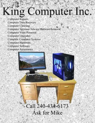
No offence, but if I saw that I would not call, it looks very amateurish, I'd go for minimalism, get rid of the strange (like broken glass) background and the picture of the PC on the desk.
Some ideas:
Take a picture of the corner of your monitor showing, "King Computers", instead of the "splints" I'd use black, and list in white letters, the title on the monitor would be cool...
Ku-sama
banned
considering the fact that it needed to be printer friendly, not photo paper friendly, i cant use alot of black... my company was made Incorperated my by boss, which is head of Trancesnd Applied Technologies i cant remember what his tag is, but he has a tag in England as well... i guess ill just type it out....
The_Other_One
VIP Member
You don't want to waste ink yet you have that background? Don't use a background, it'd probably look much better.
ceewi1
VIP Member
I'd agree with most of the comments so far. You may want to add a simple, recognisable company logo rather than the PC on the desk. This would also be a help when printing out business cards, as it's always best to have a consistent 'look and feel' on all your promotional material. The same applies with whatever font and color scheme you decide to use.
As mentioned, i'd make the font larger and get rid of the background image. Regardless of how it looks, it will become very printer intensive if/when you decide to print more posters. Also, it won't be as clearly defined when actually printed.
Is that phone number a dedicated business number, or a home number? I'd make sure that it's always answered with "King Computers", rather than "Hello". Make sure you (or someone else who can take calls for you) is always contactable, many new clients won't bother calling back if they can't get hold of you quickly.
Rambo
New Member
Get rid of the background. Make it a nice, round font, easy on the eyes, like Arial/Verdana/Trebuchet MS. Definately NOT Comic Sans 
Use simple pictures, not too involved. Place one next to the title, and one at the bottom.
Like this for example (but with a white background color):

If you are making 100's of these posters, you want them to be as lite (ink-wise) as possible.
Make your main selling points stand out. Find something to attract someone to come closer. You need an edge/enterprise. A promotion/offer, such as cheap prices.
I would say more, but I can't be bothered...
EDIT: Here's a quick mock-up:

Use simple pictures, not too involved. Place one next to the title, and one at the bottom.
Like this for example (but with a white background color):
If you are making 100's of these posters, you want them to be as lite (ink-wise) as possible.
Make your main selling points stand out. Find something to attract someone to come closer. You need an edge/enterprise. A promotion/offer, such as cheap prices.
I would say more, but I can't be bothered...
EDIT: Here's a quick mock-up:
Last edited:
bigsaucybob
New Member
Wow, Rambo that is nice. I like the logo. Definitely a good start.
computerhakk
VIP Member
As said above.. Most people just glance and if they aren't interested, the'yd walk away or ignore it. The colors are very neutral besides the picture itself and the picture isn't exactly saying "computer" but rather "this desk" when they look at it from a distance.
Get rid of all the tiny prints, most people will not try to walk up and read the fine prints but look at what catches the eye.. The big title and picture. If you want it to stand out, use bright colors (such as the paper itself) and not netural colors.
Get rid of all the tiny prints, most people will not try to walk up and read the fine prints but look at what catches the eye.. The big title and picture. If you want it to stand out, use bright colors (such as the paper itself) and not netural colors.