diduknowthat
formerly liuliuboy
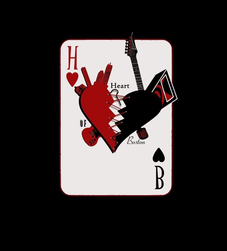
I need opinions regarding my band logo (that i've mentioned in another thread). I'm now making a poll about it.
Here's the picture
http://i31.tinypic.com/30ie4wj.jpg
Here's the picture
http://i31.tinypic.com/30ie4wj.jpg
")

 .
.