You are using an out of date browser. It may not display this or other websites correctly.
You should upgrade or use an alternative browser.
You should upgrade or use an alternative browser.
Brutally Honest Critiques
- Thread starter vroom_skies
- Start date
Gotta get some critique on the one I posted on the last page before we can critique yours.
I envision this thread working as a first come first serve basis. So if I posted up a photo, that photo would have to have some critique before the next photo can be posted.
mr.doom
Member

Ok. Not much to improve, apart from that this shot could use some small HDR. It seems there is a big difference between heavily overexposed branches by the light (to the right, and the right side of the building suffers too) and then you have almost no details in the shadows to the left. Apart from that, everything is nicely framed and composed. I especially like the water. I love the "frozen" reflections.
Bumping for the love of Bob

Looks alright but I personally think this would have looked better in colour. Unless you have one very obvious subject in your photo (for example a tree in the centre of the image) with no distractions in the background, snowy scenes tend to look better in colour I find.
I just pulled out a picture to bump the thread with ")
Geoff
VIP Member
Haha, understood
I do find that if you really want to take a unique and intriguing photo, you should do things most people won't be able to do, or generally don't do. Such as in sports most people take photos from the stands or sidelines standing up, I kneel or sit down to get an upward perspective of the players which makes all the difference. For landscapes and so forth, most people don't have UWA lenses, so shooting in UWA or using a low aperture for pleasing bokeh make all the difference")
Just for comparisons sake, here is a photo a parent took from the stands, and is pretty common to see:

To one that I took of the same team:
 Untitled by Geoff Johnson., on Flickr
I do find that if you really want to take a unique and intriguing photo, you should do things most people won't be able to do, or generally don't do. Such as in sports most people take photos from the stands or sidelines standing up, I kneel or sit down to get an upward perspective of the players which makes all the difference. For landscapes and so forth, most people don't have UWA lenses, so shooting in UWA or using a low aperture for pleasing bokeh make all the difference
Just for comparisons sake, here is a photo a parent took from the stands, and is pretty common to see:

To one that I took of the same team:
Untitled by Geoff Johnson., on Flickr
Last edited:
I wouldn't necessarily say there's too much contrast. Certainly looks fine on my monitor.Too much contrast for my liking.
I think this is more the problem...IMO it lacks anything that draws my attention, it seems more like a snapshot that anyone would take.
NikonGuy
banned
I can't find the photo on my laptop, so I'll post 3 Links, ignore descriptions please they are old.
https://500px.com/photo/75203425/water-reflection-by-benjamin-holthaus?from=user
https://500px.com/photo/75203427/docks-by-benjamin-holthaus?from=user
https://500px.com/photo/83634039/puppy-life-by-benjamin-holthaus?from=user
https://500px.com/photo/75203425/water-reflection-by-benjamin-holthaus?from=user
https://500px.com/photo/75203427/docks-by-benjamin-holthaus?from=user
https://500px.com/photo/83634039/puppy-life-by-benjamin-holthaus?from=user
Okedokey
Well-Known Member
I wouldn't necessarily say there's too much contrast. Certainly looks fine on my monitor.
I think this is more the problem...
Now thats another issue isnt it. Do you have a calibrated monitor?
Geoff
VIP Member
The color tint seems to be heavily biased towards green, and I would have used a narrower aperture such as f/8-f/11. The contrast also seems to be a bit much.
I'm not sure if it's the dock or the horizon, but it appears to be slightly tilted to the left. Again though, you don't need a 1/1250 shutter speed for a photo like this, use a much narrower aperture, f/5 is not ideal for photos like this. The contrast is also too high IMO.
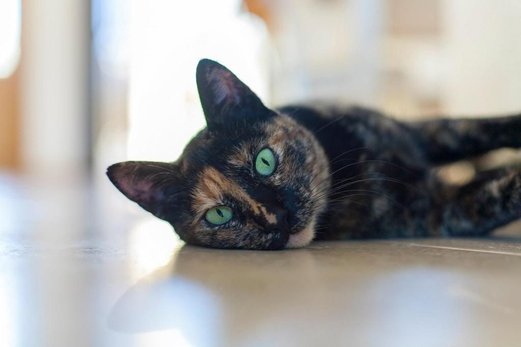
What was the reason for using a f/3.8 aperture with a ISO of 400? What were you trying to focus on? It appears to be in between the eye and ear. The photo is also crooked.
Over-saturated and the tint is too green. The shadows are also too dark.
Like Geoff said, too much contrast.
Focal point is too narrow. The nose is blurry while the fur on the head is clear.
I think it would have been better if there was just the sleeping dog in shot and you had waited until the dog behind it had gone before you took the shot.
Last edited:
Geoff
VIP Member
The tilted horizons and the dog in the background have nothing to do with your monitor. Remember, you are the one who heavily criticized Jason's work for areas being a bit soft, contrast, color, etc.You guys must have good monitors... Because I don't see any of it...
What monitor do you have?
What monitor do you have?
Looks like has two 1080p Acers going by his signature. Doesn't say which models though.