Justin
VIP Member
I like it for the most part. Did you sharpen it though? cause it looks like it's over sharpened, but it may just be my display.
nope, didn't sharpen it.
I like it for the most part. Did you sharpen it though? cause it looks like it's over sharpened, but it may just be my display.
I'd have to disagree on the tree. This is a classic foreground/background shot. Excellent day for clouds. The windblown tree on the right skyline would make a good photo in a totally separate shot especially with this sky.
If this was intended to be arty, I would be inclined to clone out the signs of habitation around the road and the white spot in the foreground woods.
To get a different look you could increase contrast up to white saturation, giving a more dramatic sky. That's not a criticism, a could-do.

")
Epic shot speedy. It left me wondering if there was supposed to be a castle down in that clearing though. Was anything taken out of the shot?
I think the Sun is attractive in itself, especially without the coloured rings/hexagons you often get. Not much could be done about the Sun in the water being saturated white. Although not planned that way, I think the bright water forms a good separation between the lighthouse and the sea it's looking over.Yes the glare is just too burned.
Another thing is that with the sun glare, the eye goes from the highlight of the water to the sun, without looking on the sides... You're only using a small portion of the picture.
I think the Sun is attractive in itself, especially without the coloured rings/hexagons you often get. Not much could be done about the Sun in the water being saturated white. Although not planned that way, I think the bright water forms a good separation between the lighthouse and the sea it's looking over.
Unfortunately not enough time to wait for the Sun to be directly behind the light, neither to hike to the other side of the light, which would have been preferred.
Putting the valid tech comments aside, the main focus of the photo is and was intended to be the Sun and it's play on the water. I picked a photo with a good selection of flaws other than deleting the main subject!I just wanted to throw this out there
So if your not open to receiving what could be very direct and potentially harsh feedback, then I'd recommend not posting a photo for review.
Hope that clears up a few things.
Putting the valid tech comments aside, the main focus of the photo is and was intended to be the Sun and it's play on the water. I picked a photo with a good selection of flaws other than deleting the main subject!
Incorporating Punk's comment, when you shoot directly into the Sun the camera on Auto, the camera will always be at fastest speed, smallest aperture. The Sun and its play on objects in the sightline will always be the focus no matter what else is in the picture.
Putting the valid tech comments aside, the main focus of the photo is and was intended to be the Sun and it's play on the water. I picked a photo with a good selection of flaws other than deleting the main subject!

My previous post wasn't targeted at any single member. It was a general all encompassing reminder. So, lets all take a step back, relax, and start over.
I'll put one up to start fresh.
PS- Did a little thread cleaning.
") .
.Awww.. but the 14 rules are essential!PS- Did a little thread cleaning.
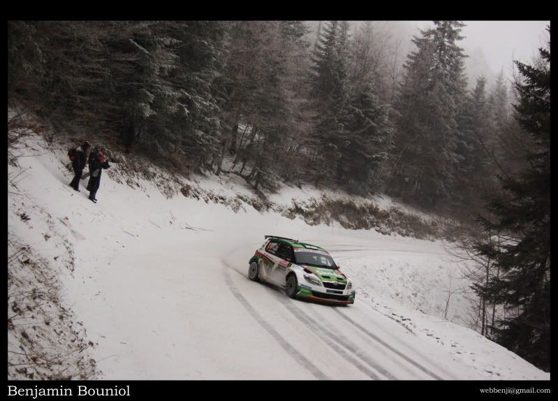
Oh well! maybe if it were exposed a bit more. a bit dark for my liking.
, but since it was taken at the end of the day, under deep fog and snow, there wasn't much light 