Brutally Honest Critiques

vroom_skies

VIP Member
Hey all,
I thought this would be a fair idea for a thread. I've seen it else where so I thought it would be nice to bring it over here.
In the past we've had users ask for critique on a photo only to get very generic responses. Obviously that isn't going to help them learn from their "mistakes" or improve upon their technique. If we'd be honest everyone of us has room to grow and in turn if we listen to the feedback given, have the chance to become a more knowledgeable photographer.

In a nut shell this thread will be about giving honest reviews of photos posted. Try to base the critique more on knows "truths" rather then personal opinion, however don't be afraid to include that either. So consider: exposure, composition, photo technique (shutter speed, aperture, iso etc), and what ever else comes to mind.

I envision this thread working as a first come first serve basis. So if I posted up a photo, that photo would have to have some critique before the next photo can be posted. Please try to make the critique worth while and not a quick word or two. Also feel free to post up a edited or re-edited version of the photo your reviewing to show the user how you envision their shot.

Hope that makes sense.

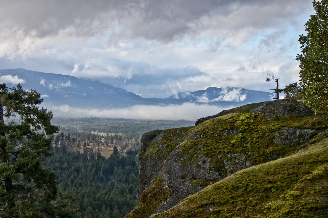
I'll start off the thread with this photo:
IMGP7802E23B.jpg
 

Nanobyte

New Member
It's not clear what the subject is supposed to be - if the boat in the foreground is it, the background should be more out of focus. I found the boat in the distance caught the eye due to its brightness and light on the water. The two fluorescent items are distracting. I would have manually desaturated them unless the photo was intended for the boat owner in which case, just the distant buoy.

Viewing on a web page is not the best. The initial impression comes from wherever you happen to scroll down to.
 

vroom_skies

VIP Member
It's not clear what the subject is supposed to be - if the boat in the foreground is it, the background should be more out of focus. I found the boat in the distance caught the eye due to its brightness and light on the water. The two fluorescent items are distracting. I would have manually desaturated them unless the photo was intended for the boat owner in which case, just the distant buoy.

Viewing on a web page is not the best. The initial impression comes from wherever you happen to scroll down to.
Thanks for the tips mate :good:. The subject was indeed the boat, although as you pointed out the background is fairly distracting. I looked right over the two fluorescent items, so at some point in time I'll be sure to correct them.
Agreed on the web page. Unfortunately there isn't much that we can do about that.
Thanks

Can photo-noobs give their point of view in hopes of learning the lingo? :rolleyes::eek:
Of course, that's one of the main reasons for this thread.
 

Rit

Member
I'm not much of a photographer, even though recently I'm trying to get into it as a hobbit. Over all it's a 'nice' picture, but not 'great'. Like Nanobyte said, there's no one object that stands out and what caught my eye for some reason was how dark and well, black the lower half of the picture is. So to me the picture seems a little out of balance.

I tried save your picture, but when I view it in Windows Photo Viewer, it gets super stretched. But looking at other boat/dock pictures it seems like that's fairly common due to the lack of light under the dock, so it seems that you need to get the right angle to try to minimize that darkspot.
 

Nanobyte

New Member
....what caught my eye for some reason was how dark and well, black the lower half of the picture is.... so it seems that you need to get the right angle to try to minimize that darkspot.
The light was not very good for this shot. In order to get the subject brighter, the Sun needed to be more behind the camera. One does not always have a choice. You could increase gamma (midpoint) but it would decrease the contrast. I quickly tried that and it was better than I thought because it also washed out the background. If the background were out of focus in addition, it wouldn't be bad.
 

diduknowthat

formerly liuliuboy
The photo seems unbalanced. There's a lot of stuff to the right and nothing to the left to balance that out.
 

speedyink

VIP Member
Anyone else think of networking when looking at the name of the boat? :p

Nice shot, but the background seems to be at better exposure than the subject..subject is a tad dark. Besides that and toning down the buoy it looks pretty solid.

So does the picture poster let us know when they're content with the critique or do we use our own judgement?
 

vroom_skies

VIP Member
Thanks for the critiques all.

Speedy- Each photo should get a bare minimum of one review before the next image is posted. Preferably two or three reviews, but that wont always happen. My shot has had more then enough so bring on the next image.
 

Nanobyte

New Member
Should pics be linked thumbnails or full size image?

I'm having difficulty finding any images that aren't obvious what needs doing.
 

Fatback

VIP Member
This is a great idea, and I can see myself using this thread a lot in the future. I'm a member of the photo forum, but usually when I ask for critique they just put my photos down. They never actually critique it, so I just stopped posting.

@Vroom I actually like the picture. What I think takes away from it though is all the stuff on the right side. I'm thinking maybe a crop would help get ride of some of the distraction.

@Speedy I'm not sure about this one, I defiantly like it though. The rock/cliff seems to be the main focal point, but the tree on the left is very distracting to me. There just seems like there is so many things going on in the picture. It keeps my eyes wondering around it. Which is a good think, you always want to capture peoples attention. I think it's could use a saturation boost, to bring out a little of the blue, and green. Other then that I don't see a lot wrong with it. Just remember next time, to try a lot of different angles. Great Capture none the less.
 
Last edited:

Rit

Member
@Speedy I'm not sure about this one, I defiantly like it though. The rock/cliff seems to be the main focal point, but the tree on the left is very distracting to me. There just seems like there is so many things going on in the picture. It keeps my eyes wondering around it. Which is a good think, you always want to capture peoples attention. I think it's could use a saturation boost, to bring out a little of the blue, and green. Other then that I don't see a lot wrong with it. Just remember next time, to try a lot of different angles. Great Capture none the less.

I completely agree with this, the tree on the left throws it off and I can't tell if you had the whole tree or none of the tree would make the picture better. But I love the color/sharpness of this picture, such a beautiful view! Where was this taken?
 

speedyink

VIP Member
@Speedy I'm not sure about this one, I defiantly like it though. The rock/cliff seems to be the main focal point, but the tree on the left is very distracting to me. There just seems like there is so many things going on in the picture. It keeps my eyes wondering around it. Which is a good think, you always want to capture peoples attention. I think it's could use a saturation boost, to bring out a little of the blue, and green. Other then that I don't see a lot wrong with it. Just remember next time, to try a lot of different angles. Great Capture none the less.

Thanks for the input :)


I completely agree with this, the tree on the left throws it off and I can't tell if you had the whole tree or none of the tree would make the picture better. But I love the color/sharpness of this picture, such a beautiful view! Where was this taken?

Yeah I also agree, that tree is distracting.
Thanks man, it's at little mountain, vancouver island.
 

Nanobyte

New Member
I'd have to disagree on the tree. This is a classic foreground/background shot. Excellent day for clouds. The windblown tree on the right skyline would make a good photo in a totally separate shot especially with this sky.

If this was intended to be arty, I would be inclined to clone out the signs of habitation around the road and the white spot in the foreground woods.

To get a different look you could increase contrast up to white saturation, giving a more dramatic sky. That's not a criticism, a could-do.
 

Russ88765

Active Member
Epic shot speedy. It left me wondering if there was supposed to be a castle down in that clearing though. Was anything taken out of the shot?
 

Justin

VIP Member
Can I have a go?

This was the best I could do on a really overcast day. I shot this with a Polarizer filter to cut some of the haze. I've been told on other forums that it's a good photo which I like but I'm not that satisfied with it.

5306112717_1219f7ed4f_b.jpg
 

Russ88765

Active Member
Great shot I think, there is a little rendering noticeability on the sky where there are no clouds though. It isn't really a huge thing though, and the rest of the photo looks like you did a good job.
 

Justin

VIP Member
thanks for the feedback :)

What do you mean by rendering? I opened up the .RAW file again too see and all I did was boost contrast, saturation and some sharpening. :)
 
Top